
Data Visualization
2026 Employee Experience Report
Client: Apex Software (Fictional)
Overview
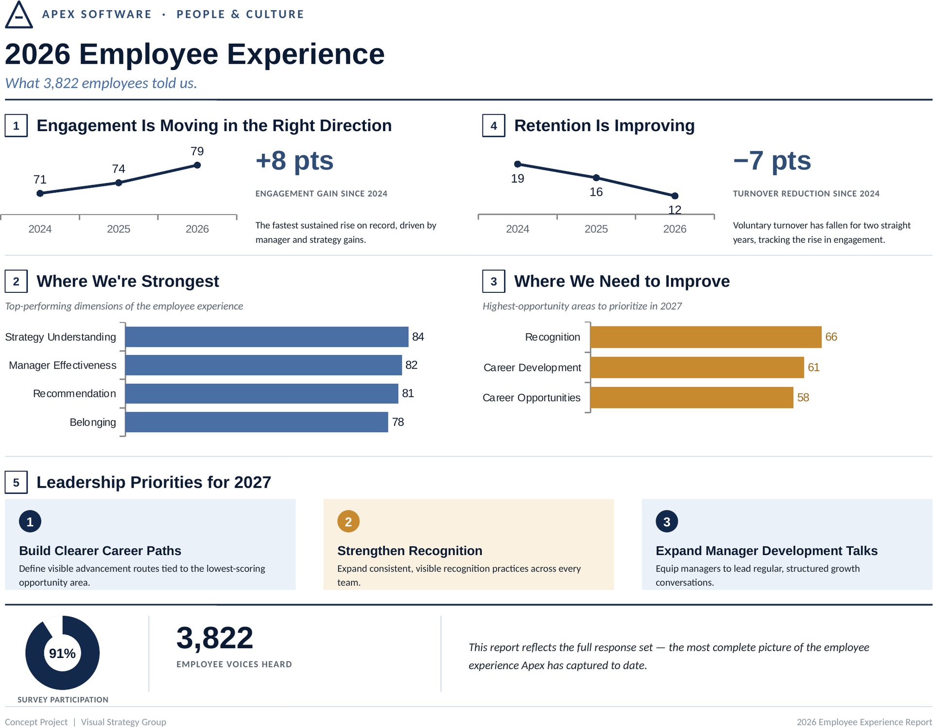
Apex Software, a 4,200-person technology company, had just completed its annual employee engagement survey: 3,822 responses across a dozen dimensions of the employee experience. Leadership had the data but no way to put it in front of executives, managers, and employees as a single, coherent story. The result is a one-page visual report that moves from strength to opportunity to trend to named 2027 priorities.
Challenge
A raw survey export is a spreadsheet, not a story: rows of percentages with no hierarchy, no narrative, and no clear answer to the question every audience asks, which is whether this is good news and what to do about it. Presented poorly, strong results like rising engagement and falling turnover get buried next to legitimate opportunity areas, and leadership walks away with data instead of direction.
Approach
We grouped every metric into a narrative arc rather than a flat list of statistics, placed the strongest and weakest results side by side so the page reads as balanced, framed every low score as a named 2027 priority instead of a deficiency, and used real charts rather than decorative icons so each number carries its own visual evidence. Opportunity areas use a muted gold rather than a warning red, and the point-change figures are sized as headlines because the change is the actual finding.
Related projects
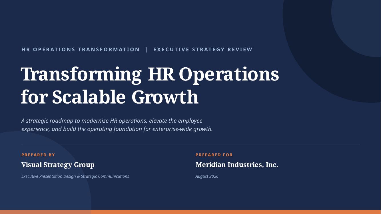
HR Transformation Strategy
A 20-slide executive presentation framing an 18-month people operations transformation.
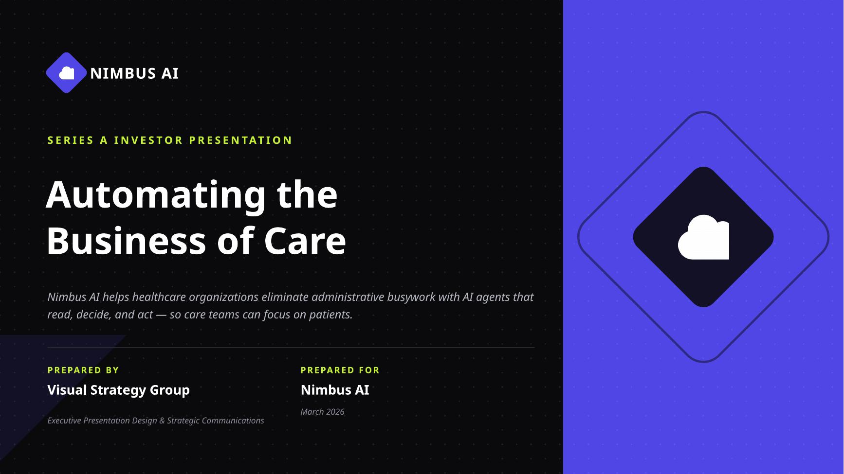
Startup Investor Pitch
A 15-slide Series A pitch deck built around problem, product, market, traction, and the ask.
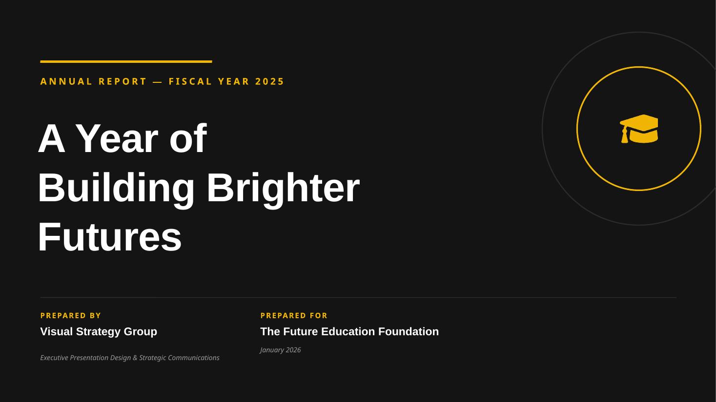
Nonprofit Annual Report
A 22-slide board briefing deck presenting the fiscal year in impact, financials, and forward strategy.
Let's create your next presentation.
Share your audience, your deadline, and what the meeting needs to accomplish.
Start your project